Kine Eeman I Physiotherapy in progress
studios I graphic design I Kine Eeman
-
Kine Eeman
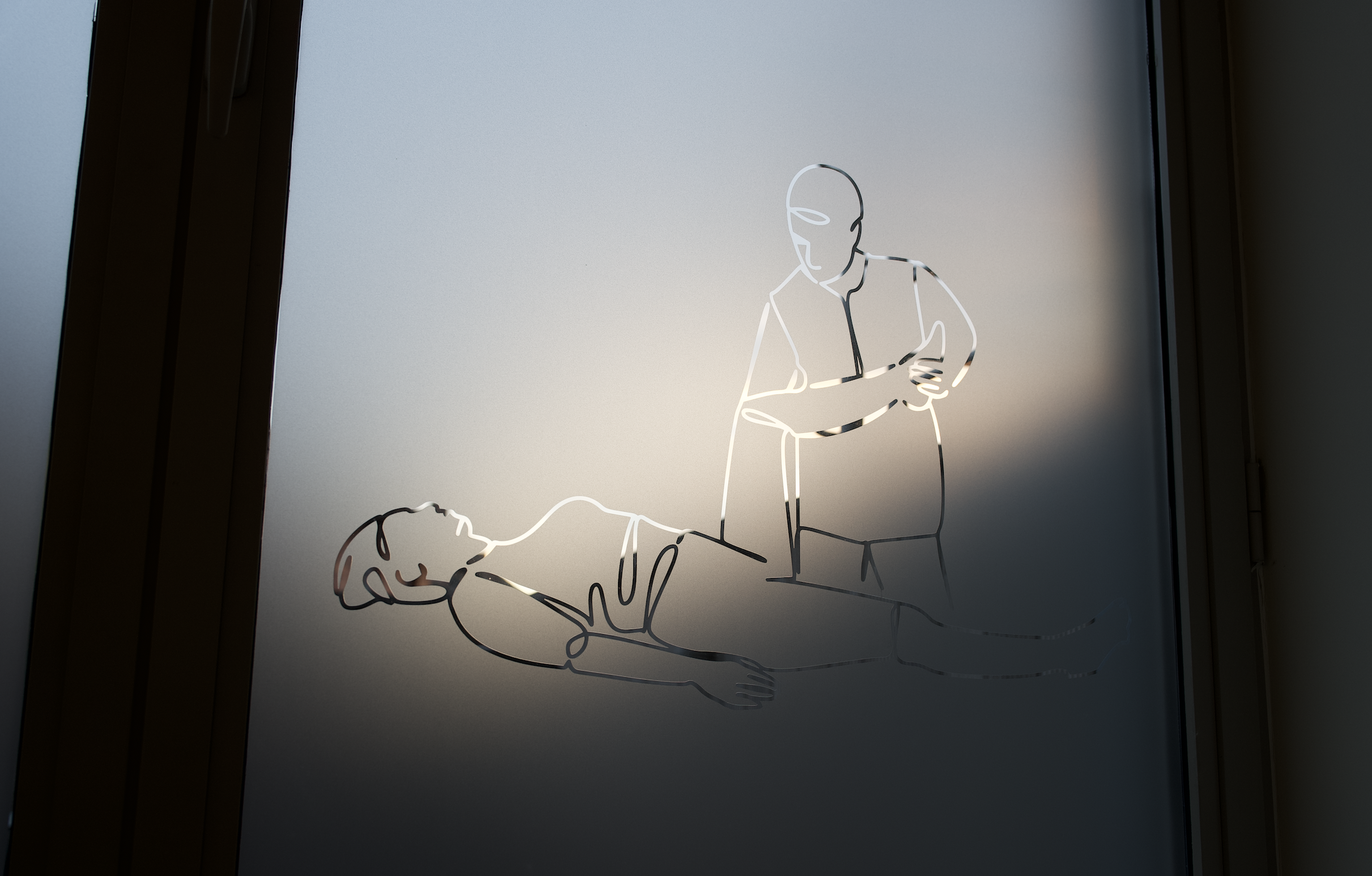
Looking ahead, Kine Eeman aspires not only to offer a physiotherapy service, but to create a complete wellbeing experience, eventually including elements such as yoga and sports. That’s why establishing the right visual atmosphere and emotional tone is essential.
-
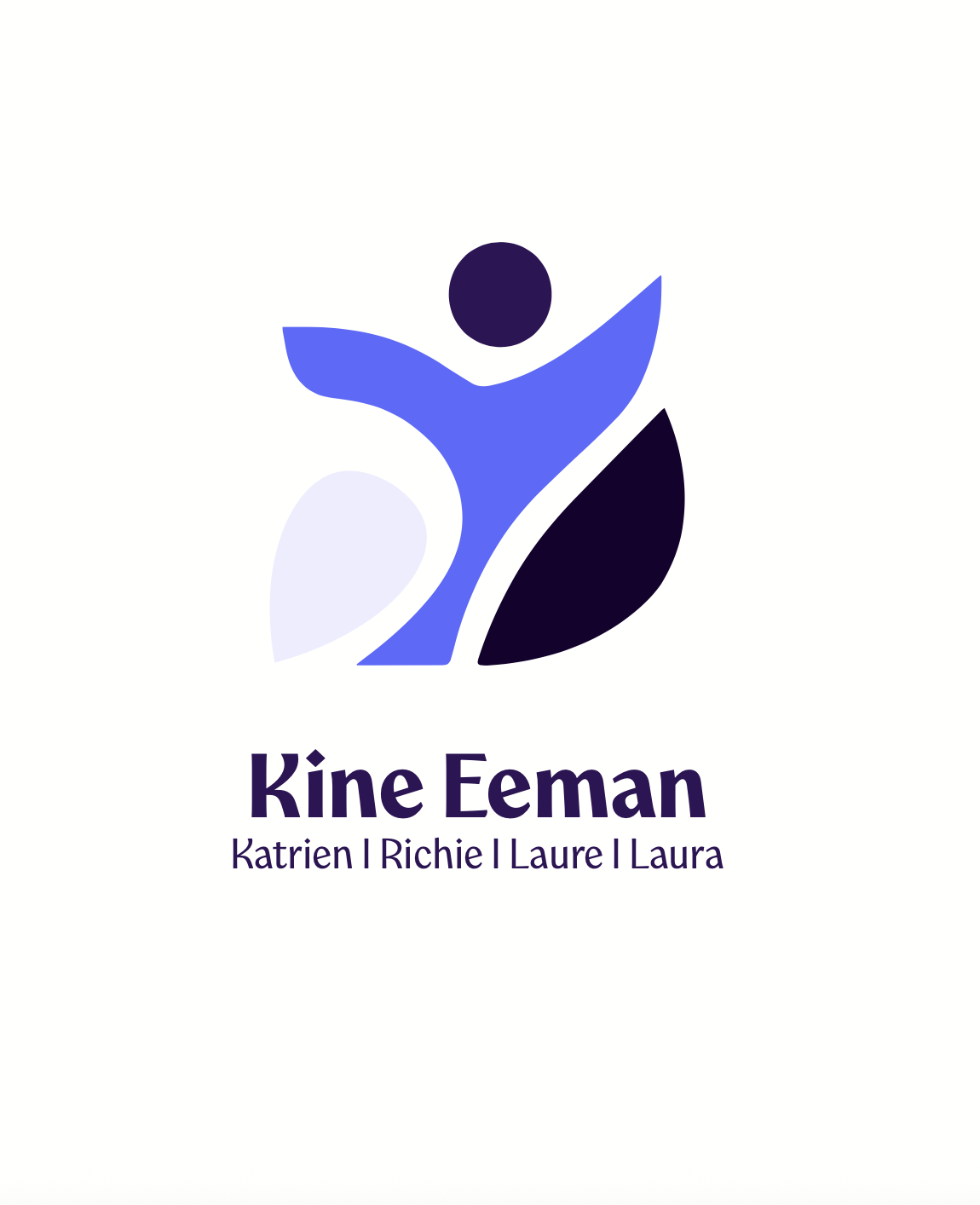
The Kine Eeman logo returns to the essence of the brand, aiming to convey a sense of serenity while maintaining an active and dynamic character.
It draws inspiration from the core movements of physiotherapy, with a subtle reference to the innovative practice where hand-blown glass plays a key role. This is reflected in the shapes that form smooth, flowing surfaces.
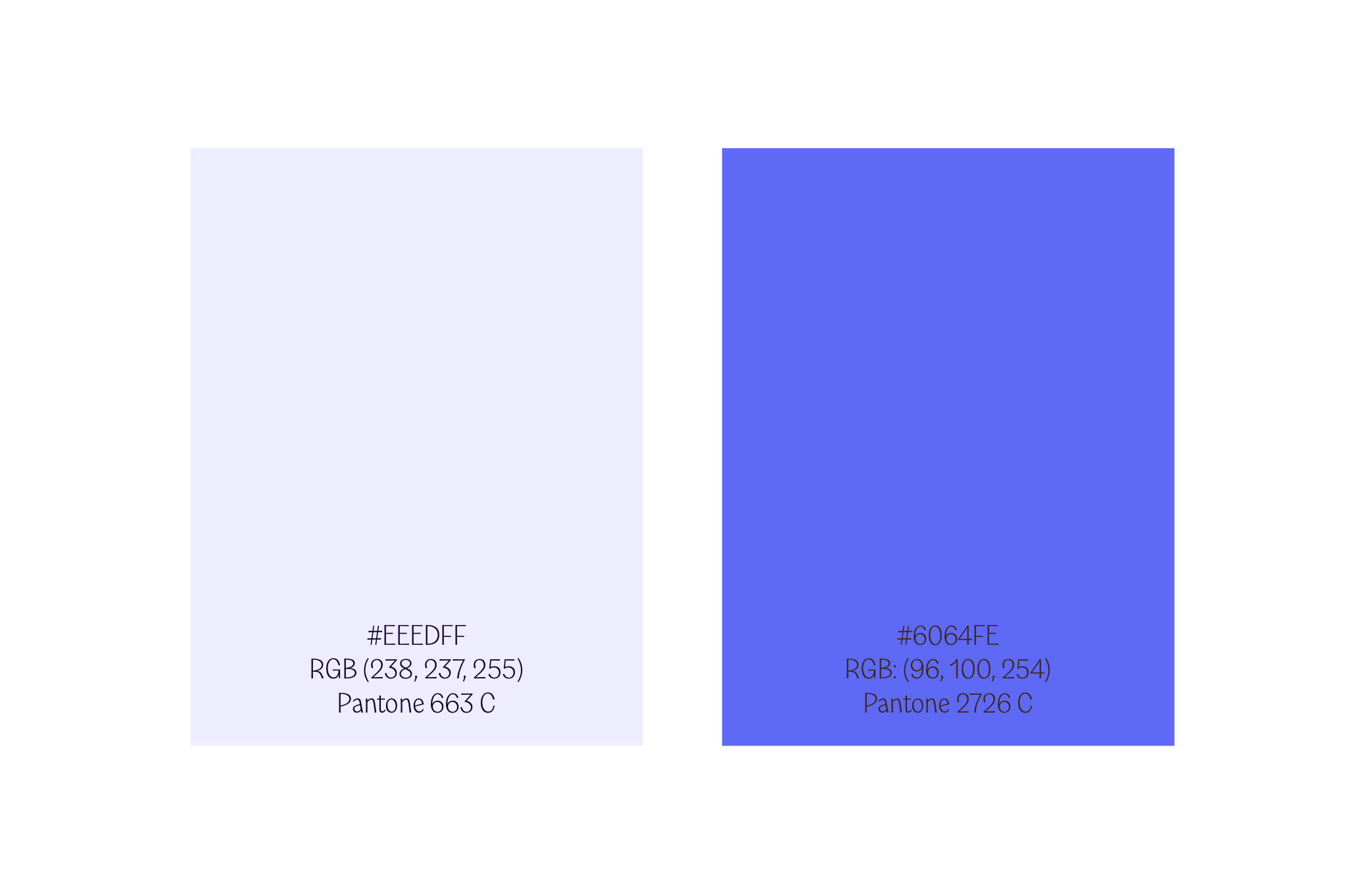
The focus extends beyond the logo design itself to the use of color. Four complementary tones were chosen: a soft blue hue, an active purple, an energizing violet, and a deep earthy shade. Together, these colors evoke calm and serenity, while also expressing quality and vitality. Values at the heart of Kine Eeman’s identity.
-
Kine Eeman VOF
Color-codes Kine Eeman

Studio
Graphic Design
Collaboration
-
Status
Finished
Service
Branding I Website
Country
Belgium, Geraardsbergen
Scope
Psychotherapy in progress
Client
Kine Eeman